Sunday, October 30, 2016

Just the Horsha

Another painting in the "Horsha" Series. Started out with a specific sketch but paintings sometimes have a will of their own and it came out quite different. 

Horsha, Hebrew for a small wooded area. Quite happy with this one, playing with the lights and shadows.


30 x 22 cm
Oils on cut canvas

Playing with Shapes Extreme Composition

Lesson II 

Part 1


Fall is at last in the air!!! A very short season here. We even had 10 minutes or less of rain. IT still warms up during the day but cooler evenings and we are now off Daylight Savings,, so will get dark earlier. 

Last week went by so fast that aside from working at my weekly workshop, I didn't get to my online course  Extreme Composition 


Explore different techniques for creating simple shapes. Try to find different techniques than those shown in the video.  This is just a page filled at random of various techniques, don't know if I found any really different on but as I go along I probably will.

Monday, October 24, 2016

Veil of Gray

This was done several months ago on a piece of masonite. Used a piece of netting. Bringing it into class I was told that it was much too busy. It was left aside for a few months and then decided to cover it in gray with a brayer and lift off with  paper, a veiling technique I learned from Dotty Seiter. I had often scraped, sanded,and rubbed with baby wipes but never tried a plain piece of paper. The piece has a lot of texture made by use of a palette knife. The sky looks lighter in real life.

I scraped areas to let some of the color come through, But now looking at the WIP I think I can bring some more color back in,  Another project for another day! Will keep it ins eye view. Appreciate any thoughts or advice.

40 x 30 cm
Oils on Masonite board


Saturday, October 22, 2016

Extreme Composition 3

Jane Davies Extreme Composition

Lesson  1  Series Backgrounds and Line Drawing


Jane strongly believes in making limitations when making a series. So with this last exercise in lesson 1 we are to choose the colors, format size, and drawing tools to make a series of backgrounds and dancing lines. Not all colors and drawing tool have to be used in each painting but the series should have a consistent  feeling.

All painted on white bristle paper, 9.5 x 9.5 " Th colors used were 2 grays, 2 oranges one quite neon that did not photograph true, 2 dulled gray-greens, and white. I mixed the grays using ultramarine blue and raw umber and then adding white.  The greens were mixed using the grays plus yellow.
Line drawings were made with black watercolor pencil brushed with water, white oil pastel, gray crayon, green crayon, and orange crayon

I made 10 backgrounds but used only seven for the final line drawings. In a few, I used a brayer to make some softer transitions.


 My Observations
First I need much more practice in handling acrylic paint.
I think for my first series I should have made a smaller format.
I am pretty happy with my gray-green mixes.
Line drawing is quite bold and similar maybe
I should have done more variation.
Feel I succeeded in making a consistent series,

Click on images to view larger in lightbox

Saturday, October 15, 2016

Playing with Acrylics

Well I finally jumped in to investigate some rather cheap acrylics that I bought some time ago and never opened. First I opened them to see what colors I have compared to my oil paints

Wanted to see which were opaque and which more transparent.  Also played around with a bit of mixing, especially interested in mixing my grays, which surprisingly was quite pleased, without black. I am still not used how fast the paints dry, and how to make soft edges.

 Did one on brown paper, bottom, which didn't come out so great so I will quad it. I now know which colors I may want to add to my collection.

I can now do Part 3 of lesson 1 of  Extreme  Compositions.   and choose what colors, format, and which drawing mediums I will use for my lines. 


Click to Enlarge

Wednesday, October 12, 2016

Extreme Composition 2

Lesson 1 Part 2 Dancing Lines on Colored Backgrounds

We were to paint colored backgrounds with soft transitions and low contrast on which to draw lines.
I worked on heavy 23 x 30 cm, brown paper mainly with watercolor crayons and water medium, one was done with OP and turps. I know that with paints the backgrounds would be much different. I will have to take that jump and learn how to handle acrylic paints.

Click on Images to enlarge

Background Watercolor Crayons with Water
Lines
White Oil Pastel
Black Graphite Stick
Pink Crayon

Background Oil Pastels
Lines
Black Oil Pastel
Ball Point Pen
White Marker
The colors in the photo are way off
Orange should be light pink !!!!

Background Watercolor Crayons with Water
Lines
Medium Marker
Sepia Stick

Background Watercolor Crayons with Water
Lines
Fine Marker
White Marker

 I find it still difficult to free myself with all the concepts of painting and just really be free to explore. 


Wednesday, October 5, 2016

New Directions Extreme Composition 1

During the 30 x 30 challenge this past September I was impressed by the work of one artist, Dotty Seiter that caught my eye at first because she was working in  B&W. I also was working mainly in charcoal and gray and white pastels. I was impressed with the works she was doing following an online course by Jane Davies,  She was doing the 100 drawings on the bottom of the page.
Following Dotty each day and seeing how her work was developing I decided that I should try one of the courses. This is my new direction. October is a month of holidays and we will only have 2 workshops so I decided to JUMP in.

Lesson 1 Lines and Dancing Lines

These are all just experiments!!!! I am really mainly posting for myself to see my own development in this course.

Did a test sheet of various lines with pencils,markers, pens, charcoal, and crayons to see their marks.
Then we were to do exercises with what Jane calls the wandering line. Letting the line go where it wants, rather intuitively.  Then add another line to compliment or go along with the first, Jane calls this a dancing line.  I many but wasn't getting really what I wanted. Need much more practice
I have a large 11 x 14 " sketchbook with fairly good quality paper. 

click to enlarge

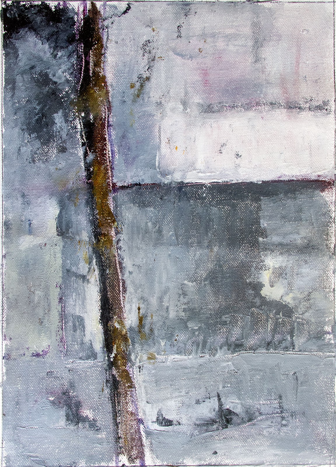
Black oil pastel and lt brown conte stick.  My observation is that it's much too busy. 

click to enlarge

This was done first with a watercolor graphite pencil and then the conte stick... photo came out too faint, but you can get the idea.  The stains are from a work on the next page. This page probably was wet when I closed the book. I like this one much better. 


click to enlarge

We were to make backgrounds with low contrast colors and do the dancing lines on them.
Background oil/wax crayons with some medium. The lines were charcoal stick and 2B graphite pencil.

 Jane works in acrylic paints. I mainly work in oils so I did experiments with my wax/oil crayons and watercolor crayons with medium and without. Not good on plain paper so did a few on heavy brown paper and pieces of cut canvas, 

click to enlarge

Top strip is watercolor crayons with water added on heavy brown paper.
Bottom strip  using my oil/wax neocolor I crayons by Caran D'Ache. with added medium of  linseed oil and turps. Like the watercolor crayons best. I have cut sheets and will do some more. 
The cut canvas trials did not work out too well. I hope to open my paints and do them again,


Tuesday, October 4, 2016

Horsha Painting # 3

This painting was based on sketch # 5.  In the Horsha there is a long wall that borders the area. Behind it a home. I sketch many of the patterns of light that showed up in the late afternoon. This is the end corner of the wall with suggestion of a building.

Although I am basically using a limited palette of grays I am adding hues for variation. Started this at workshop and finished at home. When I returned, Heleni said finished. I am usually a good camper so I stopped.


Oils on cut canvas
30 x 22 cm
Palette Knife


Reference Photo
Probably cropped the left side


Monday, October 3, 2016

Horsha Painting # 2

This painting was based on Sketch # 2 of Leslie's 30 x 30 challenge this past September. I will be doing a series of paintings from my little gray sketch book.


Oils on Cut Canvas
30 x 22 cm
Palette Knife


I did photograph some of the stages, Looking back the first stage was doing OK until I messed it up making the blotches way too dark. I then opened them up by adding a new layer of varying grays. I don't seem to have saved the reference which wasn't of the Horsha near my home,

Stage 1

Stage 2


What works in one medium doesn't automatically work in another! 


Saturday, October 1, 2016

September 30 x 30 Collage

This month flew by. Time to show off with the collage and tell a little about the experience and what I have gained. First I have gained a whole month of productivity.  This summer has been a difficult time for various medical problems, nothing serious, but still restrictive. This creativity greatly improved my mood and confidence in myself.

I chose to focus the challenge using a small gray-papered sketchbook using charcoal and pastels in monochromatic sketches.  My references were my own photos taken in a small wooded area near my home. I used PS to edit the images into B&W. I also used topaz filters.


Click to Enlarge

One more very important thing that I learned during this challenge was to use my smartphone more efficiently. I use the app "opencamera", which allowed me to take the photo, crop, resize, rename and paste it into a blog post. This took about 5 minutes. In the computer, I added text,tags etc. My photos are automatically backed up in google photos so I could then download them to my computer. Now how COOL is that!!!